Why does the user experience (UX) matter in blogging? If your blog is difficult to navigate or slow to load, visitors will likely leave without reading what you say.
Consider two examples:
- Example 1: You’ve stumbled upon a blog that takes ages to load. Images are scattered randomly, and the text is hard to read. Frustrated, you click away in seconds.
- Example 2: You visit another blog. This one loads quickly has a clean layout, and the content is easy to find. You stay, read, and even subscribe.
These simple examples highlight the vast difference that UX can make in blogging.
Why UX Matters in Blogging
UX is all about how users interact with your blog. They won’t stick around if they can’t find what they’re looking for or struggle with slow pages. A blog with good UX feels intuitive, engaging, and enjoyable to explore.
And that’s the main reason I have decided to write this post. I want to showcase the main issues that bloggers make. I want to explain why UX matters and how to create a clear and easy-to-navigate site.
So bear with me for a while.
The Rising Importance of User-Centered Design
In today’s competitive online landscape, focusing on UX isn’t a luxury; it’s a necessity. As readers are flooded with options, only the blogs that offer an engaging and easy-to-navigate experience will keep them coming back.
I personally don’t like blogs or actually any pages that are filled with not relevant content. If I do not like the site I simply press the back button within the first 1-2 seconds. I will for sure not wait until your ads will load : )
Scope of the Article
This article will dive into the common mistakes that lead to a poor user experience on blogs, how to identify and fix them, and the tools that can help along the way. Whether you’re a seasoned blogger or just starting, this guide will provide you with the insights needed to ensure your readers don’t click away unsatisfied.
Understanding Your Audience
Who reads your blog, and what do they want? Knowing your audience is key to creating a blog that resonates with readers. Without understanding them, you can’t tailor your blog to their needs.
- Example: Imagine creating a tech blog aimed at experts but filled with beginner-level content. Your target audience would quickly lose interest.
Identifying Your Target Users
Before you design your blog, you must understand who you’re designing it for. Are your readers tech-savvy millennials, busy parents looking for quick recipes, or seniors exploring new hobbies? Identifying your audience helps you create a blog that speaks directly to them.
How Users Interact with Blogs
Different users interact with blogs in various ways. Some prefer in-depth articles, while others love bite-sized content. By analyzing how your readers consume content (through surveys, comments, or analytics), you can tailor your blog’s design to match their preferences.
- Example: If your readers mainly use mobile devices, a mobile-friendly design becomes crucial.
The Connection Between UX and Reader Engagement
Good UX isn’t just about looks; it’s about connecting with your readers. A well-designed blog that takes into account readers’ preferences will keep them engaged, returning, and even sharing your content.
- Example: A blog with a cluttered design might discourage a reader who values simplicity, while a clean, minimalistic layout can attract and retain those readers.
Conclusion of Chapter 2
Understanding your audience isn’t a one-time task; it’s an ongoing process. As you learn more about your readers, you can continually tweak your blog’s design to better meet their needs. In the following chapters, we’ll delve into common UX mistakes that can push your readers away and how to avoid them.
Common UX Mistakes
What can turn a reader away from your blog? It’s often the small, overlooked UX mistakes that cause the most significant issues. Let’s explore the common blunders that can ruin the reader’s experience.
Poor Navigation Structure
A confusing navigation menu can leave readers feeling lost and frustrated.
- Example: Imagine a travel blog where the categories are mixed, and there’s no clear way to find articles about specific destinations. Readers may abandon the search and leave the site.
- Explanation: Your navigation should be intuitive, with clearly labeled sections and a logical flow. Think of it as a roadmap guiding readers through your content.
Inconsistent Design and Layout
Inconsistent visuals and layouts can make your blog appear unprofessional.
- Example: If fonts and colors vary from page to page, it can disrupt the reading flow.
- Explanation: Keeping a consistent design provides a cohesive look, reinforcing your brand and making the reading experience more pleasant.
Slow Loading Times
Nobody likes to wait for a slow webpage to load.
- Example: A photography blog loaded with high-resolution images might take too long to load, causing readers to leave before even viewing the content.
- Explanation: Optimizing images and using proper caching can significantly improve loading times, keeping readers engaged.
Overuse of Advertisements and Pop-Ups
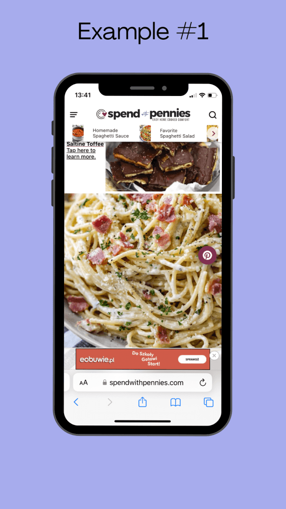
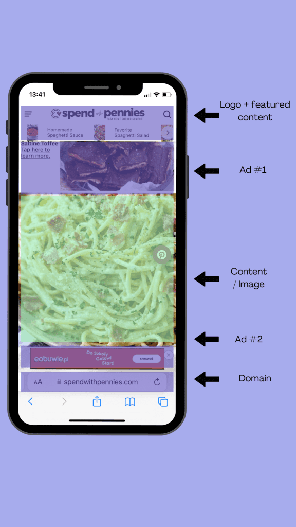
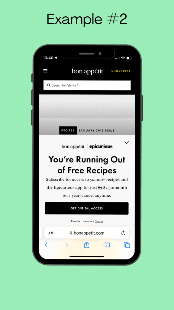
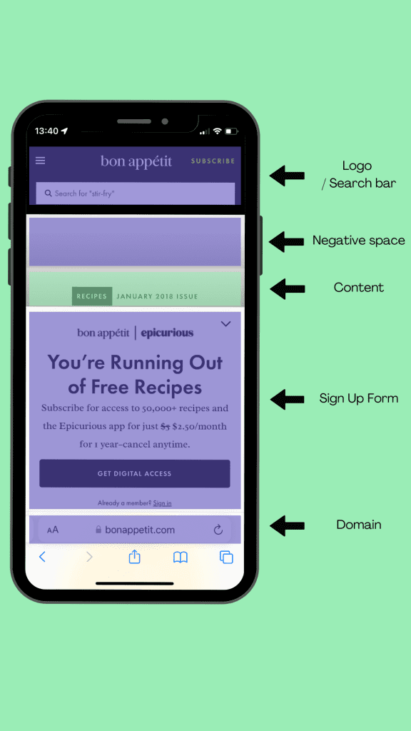
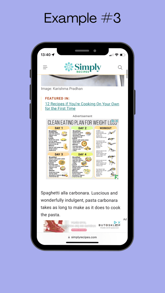
Too many ads and pop-ups can detract from the content and annoy readers.
- Example: Being greeted with multiple pop-ups upon entering a blog can feel intrusive and push readers away.
- Explanation: While ads can be a revenue source, they must be balanced and non-intrusive to maintain a positive user experience.
Lack of Mobile Optimization
Many readers access blogs via mobile devices, and a non-responsive design can ruin their experience.
- Example: If text and images don’t fit the screen properly, mobile users will struggle to read and interact with the content.
- Explanation: Implementing a responsive design ensures that your blog looks great on all devices, from desktops to smartphones.
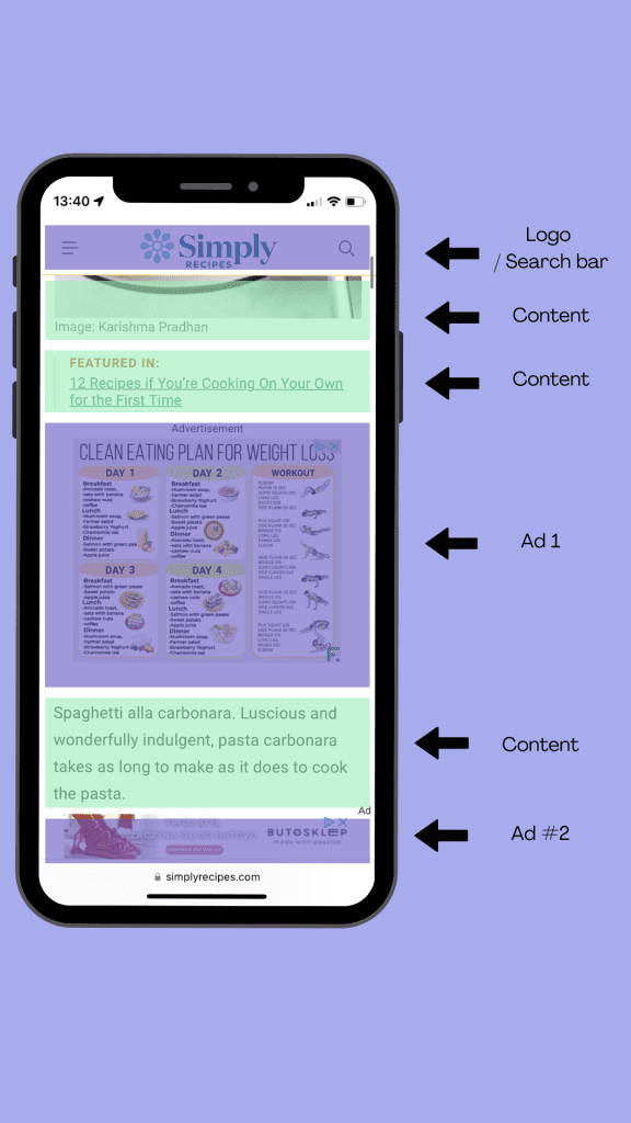
Misplaced Content and Visual Elements
Poor content placement can confuse readers and lead to a chaotic experience.
- Example: Placing a call-to-action button where it’s easily missed can lead to fewer conversions or interactions.
- Explanation: Strategic placement of content and visual elements guides readers naturally through your blog, enhancing their experience.
Conclusion of Chapter 3
Avoiding these common UX mistakes is essential for creating a blog that welcomes and retains readers. Understanding these pitfalls and how to fix them will set the stage for a blog that is not only visually appealing but also user-friendly. In the chapters to follow, we’ll explore how to elevate the UX of your blog further.
Examples of bad UX
The Importance of Content Quality in UX
Content is the heart of any blog. It’s why readers visit in the first place. But good content is more than just writing well; it’s about presenting it in a way that’s accessible and appealing. Here’s why the quality of content is pivotal to UX.
Readable and Scannable Text
Readers often skim through content. Making your text both readable and scannable ensures that they can quickly find what they’re looking for.
- Example: Breaking up long paragraphs with subheadings, bullet points, and images can make a lengthy article on gardening tips more digestible.
- Explanation: These visual cues guide readers through your content, making it easier to scan and understand.
Visual Content Considerations
Visual content like images and videos must complement and enhance the text.
- Example: In a cooking blog, step-by-step photos or videos can turn complex recipes into something anyone can follow.
- Explanation: Visual content can add depth and clarity to your writing, making it more engaging and easier to understand.
The Balance of Text and Multimedia
Striking the right balance between text and multimedia is crucial for a smooth reading experience.
- Example: A travel blog that overwhelms the reader with too many images and videos might take away from the narrative.
- Explanation: While multimedia enhances the content, overuse can be distracting. Finding the right balance helps to maintain focus on the core message.
Conclusion of Chapter 4
Content quality isn’t just about good writing; it’s about how that writing is presented. From making text scannable to using visuals wisely, every element plays a part in the user’s experience. By focusing on these aspects, you’ll create a blog that not only informs but also engages your readers. As we continue to explore UX, we’ll look into how user feedback can shape and improve your blog.
Incorporating User Feedback
What’s the best way to know if your blog’s UX is effective? Ask your readers! User feedback is a goldmine of insights that can help you refine and improve your blog’s design and content. Let’s explore how to gather and use this valuable information.
Methods for Gathering User Feedback
Different tools like Hotjar and strategies can help you tap into your readers’ thoughts and opinions.
- Example: Imagine embedding a short survey at the end of your blog posts asking readers about their reading experience.
- Explanation: Surveys, comment sections, and feedback forms can offer direct insights into what readers like or want to be improved.
How to Analyze and Act on Feedback
Collecting feedback is just the first step; understanding and implementing changes based on it is crucial.
- Example: If multiple readers point out that the font size is too small, it’s a clear sign that you need to adjust it for better readability.
- Explanation: Organizing feedback, identifying patterns, and making informed changes ensures that you’re addressing genuine concerns and improving the user experience.
Continuous Improvement through User Insights
User feedback isn’t a one-and-done deal. It should be an ongoing part of your blog management strategy.
- Example: Regularly updating a tech blog based on user feedback ensures that the content remains relevant and up-to-date with the latest trends and information.
- Explanation: By continuously seeking and acting on feedback, you can keep evolving your blog to better serve your audience’s needs.
Conclusion of Chapter 5
Your readers are the best critics of your blog. By actively seeking, understanding, and acting on their feedback, you ensure that your blog remains user-centric and continually evolves to meet their preferences. In the upcoming chapters, we’ll delve into strategies and tools that can enhance your blog’s UX further, ensuring it’s always at its best.
Utilizing Tools and Analytics
How do you take your blog’s UX to the next level? By leveraging tools and analytics. Modern technology offers insights and automation that can guide improvements and track progress. Here’s how you can make these tools work for you.
Utilizing UX Design Tools
Various design tools can streamline the creation of a user-friendly interface.
- Example: A tool like Sketch or Figma can help you design a layout that’s visually appealing and intuitive.
- Explanation: These tools come with templates and guides, making it easier for even non-designers to create engaging visuals.
Implementing Analytics
Analytics tools like Google Analytics can provide deep insights into how users interact with your blog.
- Example: Understanding where readers drop off in an article can help you identify sections that might need more engaging content or visuals.
- Explanation: Analytics allows you to track user behavior and identify trends, helping you make data-driven decisions.
A/B Testing for Optimization
Experimenting with different layouts or content structures can help find what resonates best with your audience.
- Example: Trying two different headings to see which one attracts more clicks can refine your content strategy.
- Explanation: A/B testing lets you compare different versions of a page or element, so you understand what works best.
Conclusion of Chapter 6
Utilizing tools and analytics isn’t just for large corporations; bloggers at all levels can benefit from these resources. By understanding and applying these tools, you can create a blog that’s not only appealing to the eye but also tailored to your readers’ behaviors and preferences.
Ensuring Accessibility
Is your blog accessible to everyone? Ensuring that your blog is accessible to all readers, including those with disabilities, is a vital part of UX design. Here’s how to make your blog truly inclusive.
Understanding Accessibility in UX
Accessibility ensures that all users, regardless of disabilities, can access and interact with your blog.
- Example: Providing alt text for images allows visually impaired users to understand the content through screen readers.
- Explanation: Accessibility features make your blog usable for a wider audience, ensuring no one is excluded.
Common Accessibility Challenges
Addressing accessibility might come with challenges, but they are vital to tackle.
- Example: Ensuring that videos have subtitles can be time-consuming but ensures that deaf or hard-of-hearing readers can enjoy the content.
- Explanation: Understanding and addressing these challenges makes your blog more inclusive and complies with legal standards in many jurisdictions.
Practical Steps to Improve Accessibility
There are actionable steps you can take to make your blog more accessible.
- Example: Using simple language and providing text alternatives for multimedia content are straightforward changes with a big impact.
- Explanation: These modifications ensure that content is understandable and engaging for everyone, regardless of their abilities or disabilities.
Conclusion of Chapter 7
Inclusive design is a crucial aspect of UX. By focusing on accessibility, you show empathy and consideration for all your readers, enhancing the overall experience. The principles and examples shared here can guide you in creating a blog that truly welcomes everyone.
Conclusion: Building a Blog That Doesn’t Suck
So, why does a blog suck, and what can be done about it? As we’ve journeyed through the various elements of UX, we’ve unearthed the secrets to creating a blog that resonates with readers.
- Understanding Your Audience: Knowing who you’re writing for allows you to tailor content and design that speaks directly to your readers.
- Avoiding Common Mistakes: From poor navigation to slow loading times, recognizing and rectifying these pitfalls makes for a smoother, more enjoyable user experience.
- Focusing on Content Quality: Beyond good writing, how content is presented plays a pivotal role in engaging readers and keeping them on your blog.
- Incorporating User Feedback: Listening to your readers and acting on their insights ensures that your blog remains aligned with their preferences.
- Utilizing Tools and Analytics: Modern tools empower you to make data-driven decisions and optimize your blog through insights and testing.
- Ensuring Accessibility: A truly great blog welcomes everyone, and focusing on accessibility makes that possible.
The Path Forward: Your blog is never a finished product. The world of blogging is dynamic and ever-changing. By consistently focusing on UX, seeking feedback, utilizing tools, and embracing inclusivity, you set your blog on a path to continual growth and success.
Final Thought: Creating a blog that doesn’t suck isn’t about perfection. It’s about empathy, understanding, and the willingness to adapt and grow. By applying the principles and examples shared in this guide, you’re well on your way to crafting a blog that doesn’t just avoid common pitfalls but thrives in connecting with its readers.
Take Action Now!
Ready to elevate your blog to new heights? Your path to blogging success starts here, and I’m with you every step of the way.
- Connect on Instagram: Follow me @_janvasil for daily insights, tips, and inspiration.
- Join Me on LinkedIn: Let’s network and grow together. Connect with me on LinkedIn.
- Email Me Directly: Have specific questions or need personalized guidance? Reach out to me at [email protected].
Your blog doesn’t have to suck. Let’s make it thrive together. Reach out, connect, and let’s start your blogging success journey today!


